
Stop Guessing: Read Patterns by Symbol and DMC for Colorblind Stitchers
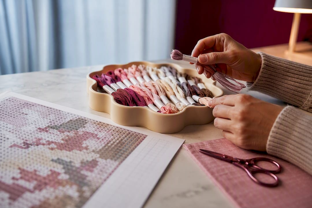
Stop Guessing: Read Patterns by Symbol and DMC for Colorblind Stitchers ! Cross-stitch chart beside coded floss skeins Stop trusting hue.
Stop Guessing: Read Patterns by Symbol and DMC for Colorblind Stitchers
Stop trusting hue. The fastest path to accurate stitching is symbol-first pattern reading, DMC thread-code logging, and choosing substitute colors by lightness rather than shade, then confirming the fix with a colorblind simulator before threading a needle. A tool like Flossom can log which DMC numbers you already own and flag duplicates, so substitutions get simpler and cheaper. Test before you commit thread to fabric.
TL;DR:
- Using symbol-based pattern reading and DMC thread codes prevents color guessing, especially for colorblind stitchers, as codes are unaffected by hue perception.
- Swapping thread colors based on lightness contrast, rather than hue similarity, ensures clearer differentiation for people with common color vision deficiencies.
- Running color palettes through simulators for deuteranopia and protanopia before stitching significantly reduces the risk of color confusion during actual work.
- Incorporating physical swatches and verifying contrast ratios in proper lighting helps confirm that chosen colors are distinguishable in real-world conditions.
- Organizing and logging thread substitutions with clear reasons minimizes repeated troubleshooting and streamlines future projects.
Table of Contents
- Colorblind cross stitch strategy: symbols, thread numbers, and smart substitutions
- Tools for testing colorblind friendly palettes before you stitch
- How to adapt a cross-stitch pattern for color vision deficiency
- Materials and texture hacks that boost distinguishability
- How to verify your adapted design actually works
- A workflow checklist and labeling system to use at the needle
- Types of color vision deficiency and how each one hits your stitching
- Lighting and workspace setup that actually helps
- Where colorblind stitchers find community and support
- Organizing your thread stash to prevent mix-ups
- What Simone's workflow with Flossom actually looks like
- Sources
Colorblind cross stitch strategy: symbols, thread numbers, and smart substitutions
Every cross-stitch chart already gives you a workaround built into the format: symbols. A pattern that shows "310" next to a black X and "3799" next to a gray dot is handing you two identifiers that have nothing to do with hue perception. Lean on those first. The moment you start treating the symbol and the DMC number as the "real" identity of a color, and the color swatch as decoration, patterns stop being a guessing game.
DMC thread numbers exist precisely because monitor RGB values, printed charts, and actual floss can render differently from each other, so relying on the number rather than the visual swatch protects you twice over, once from color vision deficiency and once from color drift between screen and skein. Thread Bare's guide to consistent chart colors makes the same point for sighted stitchers: even people with typical color vision get burned when they trust the screen over the code.
Substitution is where most colorblind stitchers get stuck, because the instinct is to swap a "similar-looking" color for another similar-looking color, which is exactly the trap. The better method is to swap by lightness. Two threads that sit at very different points on a light-to-dark scale will read as distinct even if you can't tell their hues apart, because lightness contrast survives every type of color vision deficiency. The WCAG contrast guidance that web designers use for text readability applies just as well to floss: a 4.5:1 luminance contrast between two adjacent colors is a reasonable target for keeping them visually separate in a finished piece.
Some pairings fail more often than others. Red and green of similar lightness are the classic collapse, since deuteranopia and protanopia both flatten that boundary into a muddy sameness. Swap toward pairings that hold up structurally instead:
- Blue and orange, which sit on opposite ends of most color vision deficiency confusion lines and stay separable even under strong CVD.
- A genuinely light shade paired with a genuinely dark shade of anything, since lightness difference is the most reliable non-hue cue you have.
- Cool tones (blues, teals) paired against warm tones (rust, gold) rather than warm against warm.
- Any pairing you've already run through a simulator, rather than one you're guessing at.
Once you land on a substitution, write it down immediately. A scrap of paper that says "3799 replaces 902, chose for lightness contrast against 3799 background" takes ten seconds and saves you from re-solving the same problem three projects later.
Tools for testing colorblind friendly palettes before you stitch
Guessing which colors will collide is a waste of good floss. Run the palette through a simulator before you buy anything.
- Simulate for deuteranopia and protanopia first. Those two account for the overwhelming majority of color vision deficiency cases, so they're the ones worth checking before anything rarer. A tool like the Colorblindsimulator renders your chosen colors under each CVD type and flags where two swatches visually merge.
- Read the contrast numbers, not just the picture. Good checkers report a ΔE value (how far apart two colors sit perceptually) alongside WCAG contrast ratios. If ΔE is low and contrast is under 3:1, that pairing will collapse for a meaningful share of readers, full stop, regardless of how distinct the colors look on your particular monitor.
- Build from a validated palette rather than assembling one color at a time. Presets like the Okabe-Ito and Tol Bright schemes were designed specifically to stay distinguishable across common CVD types, and they cap out around 4 to 8 colors, which happens to be the range where most categorical palettes stop being distinguishable to anyone, colorblind or not.
- Check your own color perception once, so you know what you're working with. A quick color sensitivity test tells you roughly where your confusion lines sit, which makes every later substitution decision faster because you're not guessing at your own blind spots.
- Track substitutions in something searchable. Flossom catalogs thread across 55 brands and converts codes between them, so once you've found a working DMC swap you can log it once and pull it up on the next pattern instead of rebuilding the logic from scratch.
None of these tools replace the physical swatch step later, but skipping them means you find out about a color collision after forty hours of stitching instead of before you cut floss.
How to adapt a cross-stitch pattern for color vision deficiency
Here's the actual workflow, in order, for turning a pattern you can't safely read into one you can.
- Scan for trouble zones first. Look across the chart for any spot where two adjacent symbols use colors that sit close together in lightness, particularly reds against greens or muddy browns against olives. Mark those cells before you touch a single thread.
- Extract every DMC code in the trouble zones and assign each one a unique symbol or letter. Don't rely on the pattern's original symbol set if it's cramped or repeats shapes; give yourself bigger, clearer marks in the margin of a working copy.
- Choose replacements by lightness separation first, texture or sheen second. If two threads still read the same after a lightness swap (rare, but it happens with certain saturated mid-tones), reach for a different finish rather than a different hue, since texture differences hold up independent of color perception.
- Run the new palette through a simulator and fix the order this way: adjust lightness first, add a second cue like a symbol or texture second, and only swap the hue entirely as a last resort. This sequence wastes the least effort per fix.
- Stitch a 10 to 20 stitch swatch of the adjusted section under the lighting you'll actually work in. Digital simulation is a filter, not a final answer, and floss under a lamp behaves differently than a color swatch on a screen.
- Iterate once more if the swatch still reads ambiguous, then lock it in. Most palettes need one round of adjustment. A second round is rare but not unusual for busy, high-contrast designs.
- Finalize a printed key with symbol, DMC code, and a one-line substitution note for anything you changed from the original chart. Keep that key inside your project bag, not in a separate notebook you'll lose track of.
Pro Tip: When you're recording substitutions, write the reason down too, not just the swap. "Changed 321 to 816, original collided with 700 in deuteranopia sim" tells future-you exactly why, which matters when you pick the project back up eight months from now and can't remember your own logic.
Once you've done this two or three times, the workflow gets fast. The first adaptation on a busy chart might take an evening. By your fourth pattern, you're spotting trouble zones almost on sight.
Materials and texture hacks that boost distinguishability
Hue isn't the only variable you control. Fiber finish, thread thickness, and outlining all create separation that has nothing to do with color perception.
- Mix matte and shiny finishes deliberately. Cotton floss reads flat; a metallic or rayon thread in a similar shade catches light differently and creates a visual edge even when the underlying hue is close. Designers use this exact trick to solve color-blindness problems in large-scale textile work, as seen in the Chromarama tapestry project covered by Dezeen.
- Backstitch or outline shapes where the fill colors sit too close together. A single strand of dark outline around a shape does more to define its edge than another round of hue-hunting ever will.
- Pick your fabric ground color to work for you, not against you. A pale Aida shows dark thread cleanly; a mid-tone linen can wash out anything that isn't already high-contrast against it.
- Vary thread thickness on the same design when the pattern allows it. Two strands versus one strand of the same color creates a visible weight difference that reads as separation even under simulated CVD.
Pro Tip: If you're stuck between two threads that keep collapsing into each other no matter what you try, switch one to a metallic. It's the single fastest fix that doesn't require re-picking your whole palette.
How to verify your adapted design actually works
Three checks, in this order, before you commit real stitching time.
- Run the red-green simulation, then a grayscale conversion as a second pass. Since most color vision deficiency is red-green, that's your first filter; grayscale catches anything that survives red-green but still relies too heavily on saturation alone.
- Check the contrast ratio on every boundary where meaning depends on separation, meaning anywhere the pattern needs you to tell two adjacent fill colors apart. The same 4.5:1 WCAG contrast baseline used for on-screen text readability is a solid practical floor for thread pairs.
- Stitch the physical swatch under your actual lighting. Digital checks catch most problems, but they're not a full substitute. Practitioners commonly recommend a small 10 to 20 stitch physical swatch as the final verification step, because thread sheen and fiber behave differently under a lamp than on a backlit screen.
Skip that third step and you risk discovering the problem forty stitches in, which costs a lot more than five minutes with a needle and scrap fabric would have.
A workflow checklist and labeling system to use at the needle
Keep this taped inside your project bag:
- Label every skein with its DMC code and the symbol you assigned it, not just a color name.
- Keep a running substitution log: original code, replacement code, and the reason for the swap.
- Store all active threads for one project in a single bag, and mark that bag in Flossom or a paper index so you're not hunting across your whole stash mid-row.
- One rule above all: if in doubt, swatch it. A two-minute test beats an hour of unpicking.
Types of color vision deficiency and how each one hits your stitching
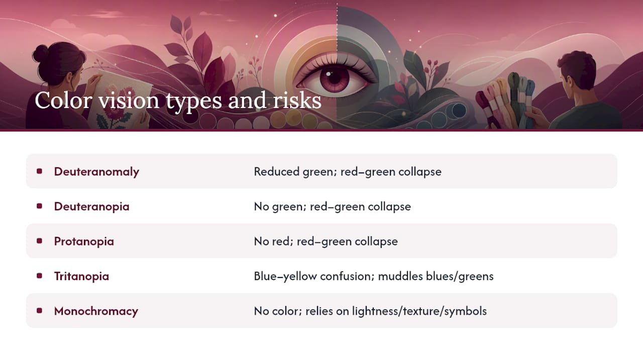
Most color vision deficiency falls into the red-green family: deuteranomaly (reduced green sensitivity), deuteranopia (no green sensitivity), and protanopia (no red sensitivity). These three make red and green threads of similar lightness collapse into a shared gray-brown zone, which is exactly the confusion line that wrecks Christmas ornaments, autumn foliage, and holly patterns.
Tritanopia, the blue-yellow type, is far rarer but hits differently in cross stitch. It tends to muddy blue-green and yellow-green boundaries, which trips up sky gradients and floral greenery where designers lean on subtle warm-cool shifts within the same color family.
Monochromacy, true absence of color perception, is rare but means every single distinction in a pattern has to come from lightness, texture, or symbol, since hue offers nothing at all. If that's your situation, the substitution rules above aren't optional extras, they're the entire method.
Knowing which type you have changes your priority order. Red-green deficiency means checking those confusion lines first. Tritanopia means paying closer attention to blue-yellow gradients that most guides don't even flag as risky.
Lighting and workspace setup that actually helps
Lighting changes what a thread looks like more than most stitchers assume, colorblind or not. A cool white LED (roughly 5000K to 6500K) renders colors more accurately than a warm incandescent bulb, which shifts everything toward yellow and can flatten distinctions that would otherwise hold up.
Position your light source to hit the fabric directly rather than casting a shadow from your stitching hand, and if you swatch-test under one light, stitch the final piece under that same light. Switching from daytime lamp to evening lamp mid-project can shift how a substitution reads, sometimes enough to undo a fix that worked perfectly that morning.
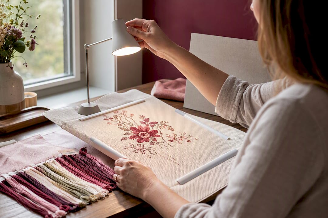
A matte white or light gray surface behind your hoop reduces glare that can wash out subtle lightness differences between threads. If you're testing swatches against your simulator results, do it under the same bulb you'll stitch under, not whatever light happens to be on in the room.
Where colorblind stitchers find community and support
You're not solving this alone, and you don't have to reinvent every workaround. Cross-stitch forums and pattern-sharing communities increasingly have threads specifically for color vision deficiency adaptations, where stitchers post their DMC substitution lists for popular commercial charts so nobody has to start from a blank simulator run.
Pattern designers themselves are worth reaching out to directly. A growing number will provide a symbol-heavy version of a chart, or share the original code list in a spreadsheet, if you ask before you buy. That single request can save hours of extraction work on a complex design.
Social stitching groups built around accessibility topics tend to be more useful than general cross-stitch groups for this specific problem, simply because the people posting there have already run into the same red-green collapse you're dealing with and tested their way out of it.
Organizing your thread stash to prevent mix-ups
Confusion at the needle usually traces back to disorganization at the storage bin, not the pattern itself. Sort skeins by DMC number in numeric order rather than by "color family," since color-family sorting assumes you can visually group by hue in the first place.
Bobbins or floss cards with the code printed or written directly on them beat loose skeins every time, because you're reading a number instead of trying to match a color by eye in a drawer. A dedicated stash organization method built around code-first labeling removes the hue-matching step entirely from your storage system, not just your pattern reading.
Keep a master list, digital or paper, of every code you own, cross-referenced against what each current project needs. That's the exact gap Flossom's shopping list feature is built to close, comparing your stash against a pattern's requirements so you're not buying a third skein of 310 because you couldn't tell it apart from the two you already had.
What Simone's workflow with Flossom actually looks like
Small swaps make the biggest difference. Simone relies on Flossom's camera color picker to check a thread against its actual DMC number before assuming a match by eye, and uses barcode scanning at the craft store to confirm a skein isn't already sitting in the stash at home. Brand conversion matters more than people expect. A pattern written for Anchor codes translated instantly into DMC removes an entire layer of color-matching guesswork. An exportable shopping list, compared automatically against what's already owned, has stopped more duplicate purchases than any amount of careful label reading ever did.
— Simone
Sources
Test your palettes with Colorblindsimulator for protanopia and deuteranopia checks, and build starter palettes from the Okabe-Ito and Tol Bright presets. Use Adobe Color's accessibility guidance as your practical luminance rule of thumb. For stash management, DMC and Anchor cataloging, and brand conversion, Flossom's tools page and project time calculator cover the workflow end to end.
- Colorblind-Safe Palette Builder - Online Check & Generate Schemes
- Colorblindsimulator
- Creating cross-stitch charts with consistent colors | Thread Bare
- Chromarama/Kukka tapestry design and color-blindness coverage — Dezeen
Recommended
We make Flossom — the calm app for cross-stitchers and embroiderers who want their stash, projects, fabric and shopping list in one tidy place.