
Stop Muddy Results: Plan a Cross Stitch Palette in 10–20 Colors
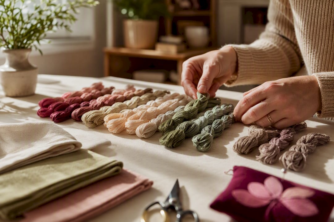
Stop Muddy Results: Plan a Cross Stitch Palette in 10–20 Colors ! Hands arranging a cross stitch color palette Pick a dominant color first, set a realistic color count for your project type, and build in at least two value steps between anything touching.
Stop Muddy Results: Plan a Cross Stitch Palette in 10–20 Colors
Pick a dominant color first, set a realistic color count for your project type, and build in at least two value steps between anything touching. Swatch your top choices on the actual fabric under daylight before buying a single skein, then convert to DMC or your preferred brand and generate a shopping list. A physical DMC color card and a tracker app can make the last step painless instead of a guessing game.
Table of Contents
- What Is the Simplest Way to Plan a Cross Stitch Color Palette?
- Color Theory for Embroidery: Value, Hue, and the 60-30-10 Rule
- How Many Colors Should You Use for Cross Stitch?
- Which Tools Help You Build a Cross Stitch Palette Faster?
- Why Fabric Choice and Lighting Change Your Color Results
- How Do You Turn a Finished Palette Into a Shopping List?
- Three Starter Palettes You Can Adapt Right Now
- Simone's Practical Habits for Reliable Palette Planning
- Try Flossom to Manage Your Palette From Swatch to Skein
- Sources
- FAQ
What Is the Simplest Way to Plan a Cross Stitch Color Palette?
Cross stitch color planning is really just a filtering exercise: you're taking a photo or a design idea with thousands of possible shades and narrowing it down to a small set that reads clearly in thread. This is sometimes called color scheme development or embroidery color mapping, but the process is the same no matter what you call it. Here's the order that actually works, step by step:
- Decide your project type and target color count. A logo needs far fewer shades than a photo-realistic portrait.
- Choose your dominant color first, then pick one or two secondary colors and a single accent. Building outward from one anchor color keeps the whole palette cohesive.
- Extract colors from your reference using a converter or eyedropper tool, then strip out any color used for fewer than 5 to 10 stitches. Most pattern-conversion guides treat those tiny outliers as noise, not detail.
- Stitch a small test swatch and check it in daylight. If two adjacent areas start to blur together, one of them needs a value adjustment.
- Finalize the palette, map every color to your thread brand of choice, and build a shopping list with a small margin of spare skeins.
Skip step four and you'll find out the hard way, three hours into stitching, that your "navy" and "midnight blue" look identical from across the room.
Color Theory for Embroidery: Value, Hue, and the 60-30-10 Rule
Value, meaning how light or dark a color is, matters more than hue for cross stitch legibility. Two colors can be completely different hues and still merge visually if their values are too close, while two colors of the same hue family separate cleanly if their values differ enough. Adjacent stitched areas should differ by at least two value steps to avoid reading as one blob, a principle borne out in color theory guidance built specifically for thread work.
Inside each hue family, aim for three to four distinct value steps: a light, a mid, a dark, and optionally a very dark for deep shadow. That's the backbone of a workable custom color palette.
- Warm grays read as believable shadow in warm-lit scenes; cool grays work better in shadowed or overcast areas.
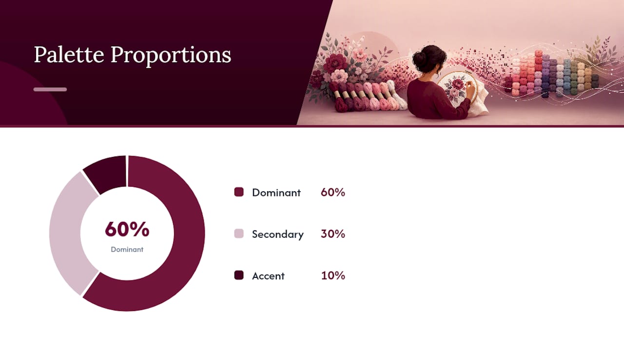
- The 60-30-10 rule keeps your palette from feeling chaotic: roughly 60% dominant color, 30% secondary, 10% accent, distributed across your value steps rather than dumped into one spot.
- Mid-tones are the safest bet when converting from screen to thread. Extremely saturated purples and violets are notoriously the hardest to translate accurately.
Pro Tip: Build your value steps before you touch hue. Squint at your reference image, or convert it to grayscale on your phone, and you'll immediately see where values actually separate.
About 10 to 20 colors handles most cross stitch designs well, and that range only works because each color earns its place through a real value or hue distinction, not because more colors automatically add realism.
How Many Colors Should You Use for Cross Stitch?
Fewer colors almost always stitch better than more. A cluttered 40-color palette tends to look muddier at normal viewing distance than a tightly edited 18-color one, because each color no longer has enough real estate to register clearly.
| Project type | Recommended color range |
|---|---|
| Icons and logos | 5 to 15 |
| Pet portraits | 10 to 20 |
| Landscapes | 20 to 30 |
| Detailed portraits | 30 to 40 |
| Full scenes | 30 to 50 (lean toward the low end) |
If a converter spits out 40-plus colors, try dropping the target to around 30 and comparing the stitched result. A rough guide is one color per 300 to 500 stitches, so a 10,000-stitch pattern comfortably handles 20 to 30 colors. Merge near-duplicate shades, cut anything with a tiny stitch count, and use thread blending for gradual transitions instead of adding another single-use color. The payoff isn't just visual. Fewer colors means less bobbin-switching, easier stash management, and lower cost.
Which Tools Help You Build a Cross Stitch Palette Faster?
Auto-converters are a genuinely useful first pass, but they're not the finish line. Set a target color count before you run the conversion, then plan on manually refining whatever comes out the other side. Converters using perceptual color distance methods like CIEDE2000 tend to produce fewer near-duplicate picks and handle skin tones more accurately than tools relying on plain RGB distance.
- Run your photo through a converter set to 18 to 22 colors as a starting point, then simplify by hand from there.
- Use a multi-brand conversion tool when your first-choice DMC number isn't available, or when you're matching against thread you already own.
- A camera color picker lets you pull a color directly from a photo of fabric, paint, or reference art instead of eyeballing a hex code.
- Once your palette is set, a stash catalog turns it into an actual shopping list instantly, cross-checked against what you already have.
This is where a tool like Flossom fits into the workflow: its camera color picker extracts colors straight from photos, its brand-conversion tool works across 55 thread brands, and its stash catalog turns a finished palette into a shopping list automatically. The full sequence looks like: photo in, converter set to 18 to 22 colors, manual simplification, test swatch, match against your stash, then buy only what's missing.
Why Fabric Choice and Lighting Change Your Color Results
Your fabric color is part of the palette whether you plan for it or not. White Aida, cream Aida, and colored Aida all shift how every thread color reads against it, so pick fabric before finalizing your final color choices, not after.
- Check swatches under natural daylight or a 5000 to 6500K daylight-balanced LED, since testing under consistent, accurate light is the step most stitchers skip.
- Photograph your test swatches the same way each time so you can compare results fairly across sessions.
- Stitch a small patch of 50 to 100 stitches at your intended strand count and step back to judge separation at normal viewing distance.
- If you find yourself converting palettes often, a physical DMC color card is worth owning. Printed swatches and screen colors are notoriously unreliable compared to real thread.
Pro Tip: Photograph your swatch next to a scrap of the exact fabric you'll stitch on. Colors that look fine floating in isolation can shift once they're surrounded by cream or ecru Aida.
How Do You Turn a Finished Palette Into a Shopping List?
Once your colors are locked, the goal is converting a palette into an actual, error-free order without duplicate buying or last-minute skein shortages.
- Organize skeins by value family and label bobbins with DMC numbers or your chosen brand's equivalents, so light, mid, and dark tones stay visually grouped.
- Check your existing stash first, using a barcode scanner or camera picker where available to confirm what you already own before adding anything to a cart.
- Calculate floss needs from your stitch count, then add a 10 to 20% spare margin to cover blending, mistakes, or repairs later.
- Test any brand swap on a small area first. DMC carries roughly 489 solid colors and Anchor about 444, and close matches between brands can still differ slightly in sheen or value.
An app that already tracks your organized thread stash turns this from a spreadsheet chore into a couple of taps.
Three Starter Palettes You Can Adapt Right Now
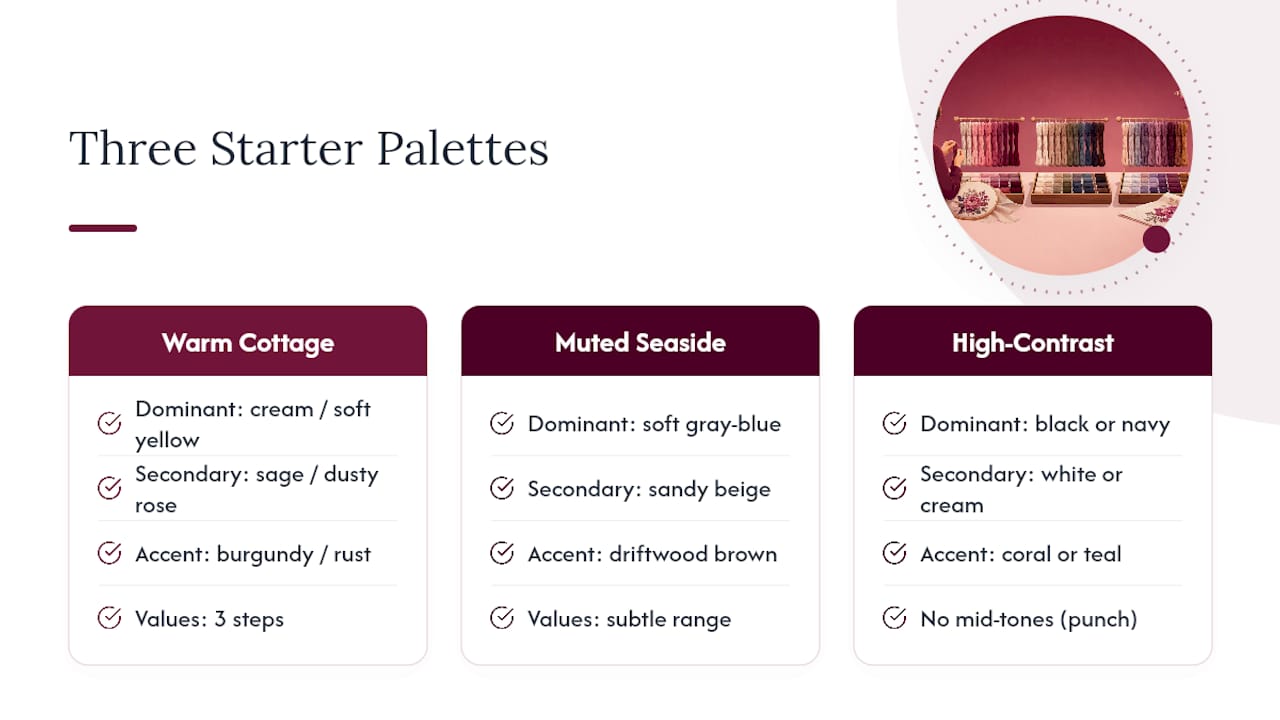
A warm cottage floral palette works well as a dominant cream or soft yellow, a secondary sage or dusty rose, and a small burgundy or rust accent, each with three value steps. A muted seaside palette leans on a dominant soft gray blue, a secondary sandy beige, and a driftwood brown accent. A high contrast graphic palette drops to just a dominant black or navy, a secondary white or cream, and one bold accent like coral or teal, deliberately skipping mid-tones for punch.
Say a converter hands you a noisy 35-color output from a pet photo. Group the near-duplicate browns and tans into two or three value bands instead of eight, drop anything under 10 stitches, and you'll usually land around 18 usable colors without losing the portrait's likeness. Map whichever template fits your reference image, then run it through your converter with that count as the target from the start.
Simone's Practical Habits for Reliable Palette Planning
Swatch before you buy, always, and keep a lean "working palette" per project instead of an ever-growing color list. If you're checking contrast for colorblind-friendly readability, label your values numerically rather than relying on color names alone, photograph swatches under the same light each time, and ask someone else to look at the contrast before you commit to fifty skeins.
— Simone
Try Flossom to Manage Your Palette From Swatch to Skein
This tool turns everything above into a few taps instead of a spreadsheet and a shoebox of floss. It features a camera color picker to pull colors straight from a reference photo, a conversion tool across numerous thread brands to avoid being stuck without a preferred number, and a stash catalog that checks your palette against what you already own before generating a shopping list.
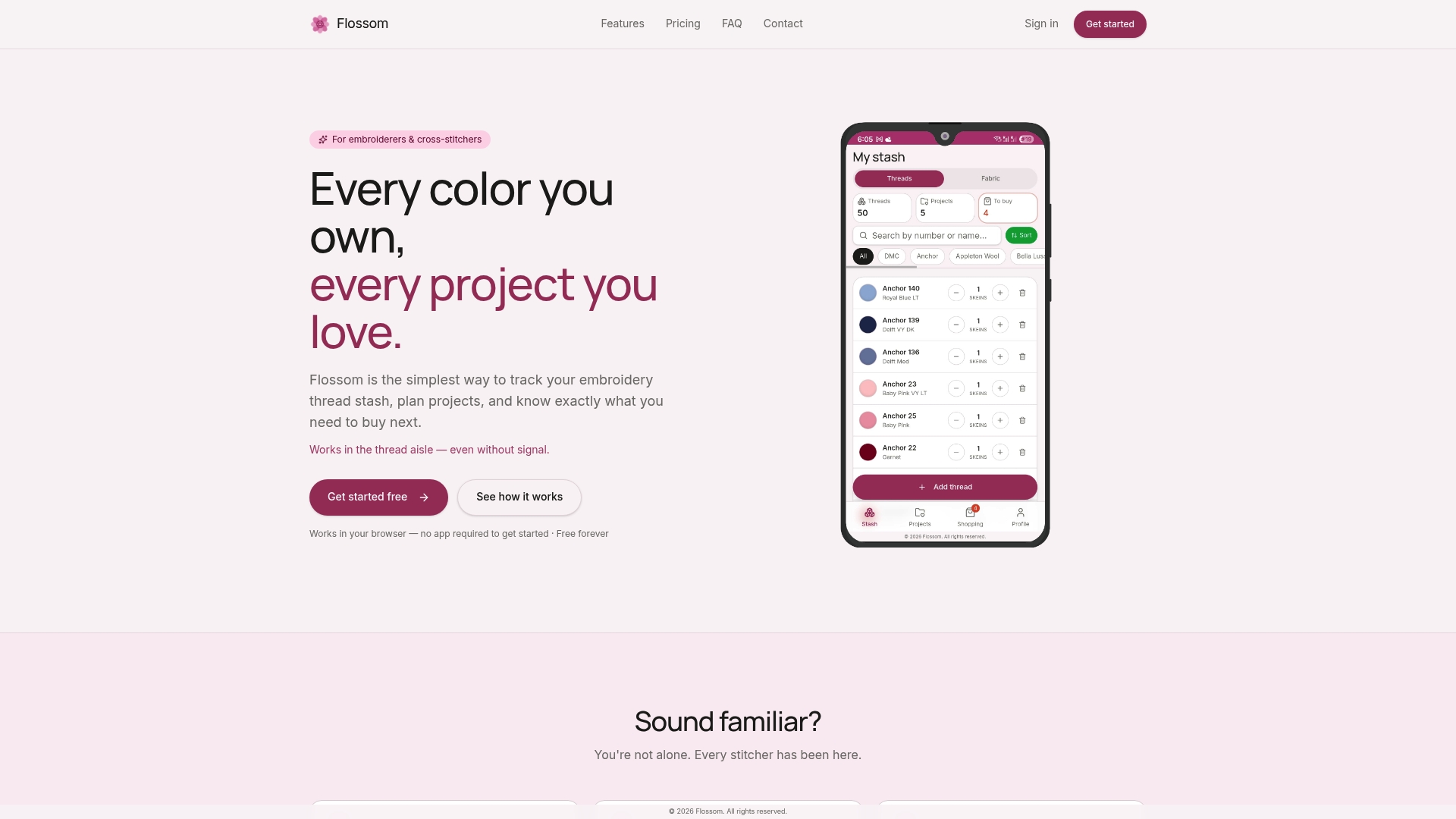
Import a pattern PDF, use the interactive chart reader to preview your color mapping, and let Flossom flag exactly which skeins to buy versus which ones are already sitting in your stash. The free tier covers DMC and Anchor with unlimited stash tracking and three projects. Flossom Pro unlocks all 55 brands, the camera picker, and unlimited projects for $14.99 per year. If you want to see the workflow before committing, browse the free pattern library and run one of its palettes through your own stash first.
Sources
- How to Choose a Color Palette for Cross Stitch
- Cross Stitch Color Theory — Screen vs Thread, Value & Mixing
- Cross-Stitch Pattern Planning Guide — Fabric Count, DMC Colors & Sizing | ArtPatt
FAQ
Can AI design cross stitch patterns?
AI tools can convert a photo into a stitchable grid and suggest thread matches, but they still default to high color counts that need manual simplification for a clean, stitchable result.
What color trends are shaping cross stitch in 2026?
Muted, nature-inspired palettes with limited color counts continue to gain ground over dense, photo-realistic conversions, largely because stitchers have found that fewer, well-chosen colors make projects more enjoyable to finish.
What are the best color combinations for embroidery?
The most reliable combinations follow the 60-30-10 rule: one dominant color, one secondary color, and a single accent, each built out across two to four value steps rather than piling on new hues.
How do I plan a cross stitch pattern's colors before buying thread?
Pick your dominant color, set a target count based on your project type, extract and simplify your palette with a converter, swatch it on your actual fabric under daylight, then use a tool like Flossom to convert the final list into a shopping list against your existing stash.
How many colors should a beginner cross stitch project use?
Beginners generally get the cleanest results with 6 to 15 colors, since smaller palettes are easier to manage and less prone to muddy-looking results than sprawling ones.
Recommended
We make Flossom — the calm app for cross-stitchers and embroiderers who want their stash, projects, fabric and shopping list in one tidy place.